Yannick Röösli
Mobile Menu
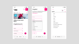
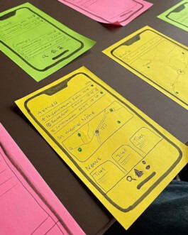
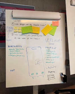
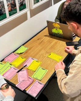
Selected Work
Playground
About
Yannick Röösli
[ close ]
[ menu ]